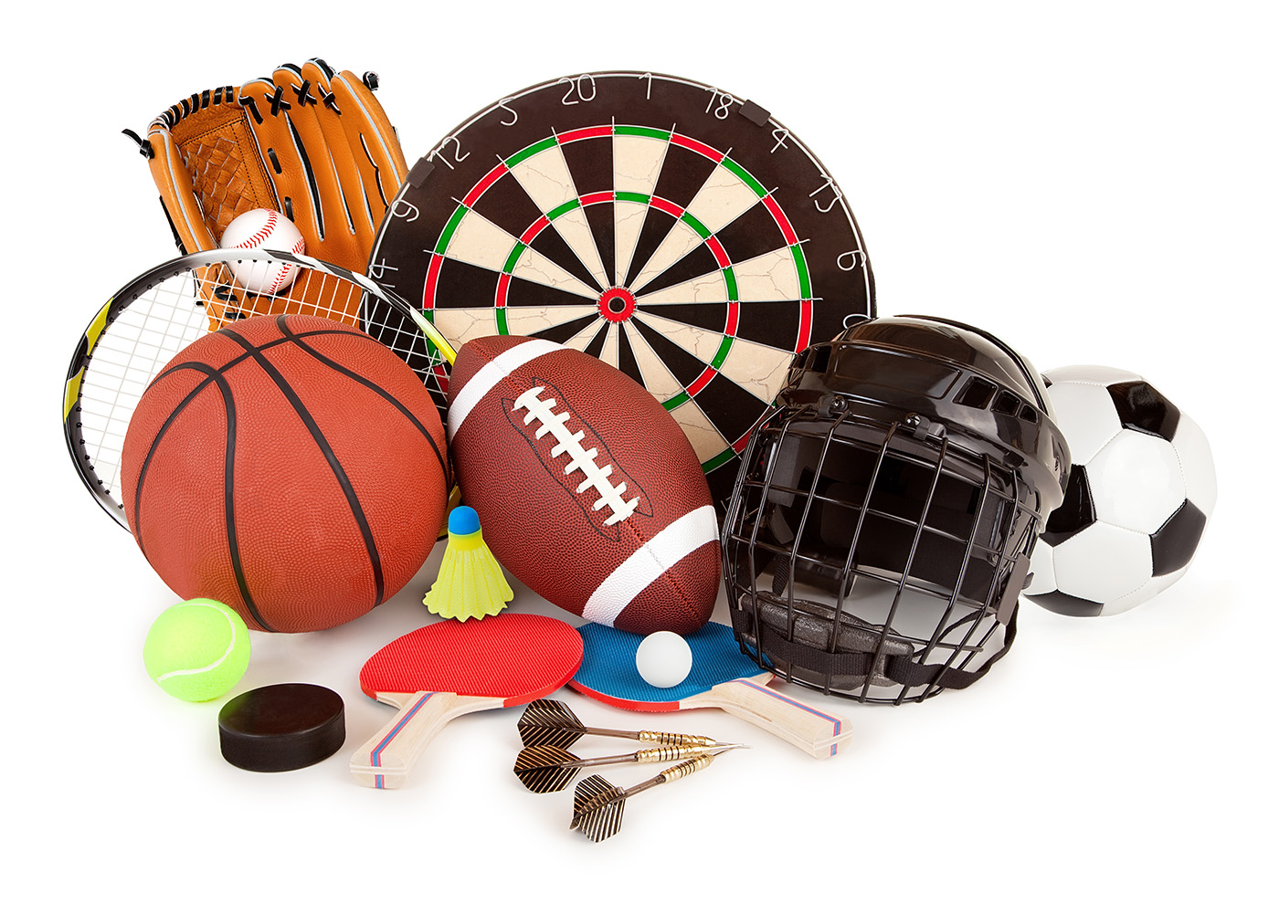
Business

Mastering HTML Radio Button Styling: A Comprehensive Guide

HTML radio buttons are a staple of web forms, but their default appearance leaves much to be desired. In this blog post, we’ll walk through one of my favorite methods to customize the look of radio buttons using CSS, creating a more user-friendly and visually appealing experience.

Let’s Begin by Hiding the Radio Buttons!

We need to start by acknowledging the limitations of cross-browser styling for radio buttons. While it’s frustrating that we can’t style them directly, we can use workarounds. In this example, the first step is to hide the actual radio button input. I know this sounds odd, but we know that we can’t style them, so we just need to take them out of the equation.

However, this should be done in an accessible manner, ensuring that it remains functional for all users. This can be achieved by using the following set of styles that visually hide the content while retaining its usability:

input[type="radio"] {
  border: 0 ;
  clip: rect(1px, 1px, 1px, 1px);
  height: 1px ;
  overflow: hidden;
  padding: 0 ;
  position: absolute ;
  width: 1px ;
}

Creating the Custom Radio Buttons

To create the custom appearance of the radio button, we’ll leverage the ::beforepseudo-element on our label along with some simple CSS to create the look we’re looking for.

For our example, the HTML looks like this:

<form>
    <h1>Can We Style HTML Radio Buttons?</h1>
    <ul>
        <li>
            <input type="radio" value="yes" name="option" id="yes" />
            <label for="yes">Yes</label>
        </li>
        <li>
            <input type="radio" value="no" name="option" id="no" />
            <label for="no">No</label>
        </li>
        <li>
            <input type="radio" value="maybe" name="option" id="maybe" />
            <label for="maybe">Maybe</label>
        </li>
      </ul>
</form>

To start, we’ll add the following styles to our label element:

label {
  display: inline-flex;
  align-items: center;
}

This will ensure that once we add our radio button styles, it will be properly vertically aligned with the label text.

Now, we’ll add our mock radio buttons using the ::before pseudo-element:

label::before {
  content: '';
  display: block;
  height: 1.25em;
  width: 1.25em;
  border: solid 1px #ccc;
  border-radius: 50%;
  margin-right: 0.5em;
}

At this point, we have something that is starting to resemble a radio button list, but if we click on the radios, we will see that nothing is happening. Although the pseudo-element visually resembles a radio button, it lacks interactivity because we have not yet handled the checked state.

Handling Interaction and States

We can handle the checked state with the :checked pseudo-class and adjacent sibling selector on our label:

input[type="radio"]:checked + label {
  color: black;
}

For the inner dot, we can leverage a radial gradient on our pseudo-element:

input[type="radio"]:checked + label::before {
  background: radial-gradient(0.75em circle at center, currentColor 50%, transparent 55%);
  box-shadow: 0 0 1em 0 rgba(10, 150, 255, 0.75);
  border-color: currentColor;
}

There, now when we click on these, they function much like native radio buttons. And we can enhance the interactions by adding some transition effects:

label::before {
  ...
  transition: border ease-in 150ms, box-shadow ease-in 150ms;
}

Let’s Not Forget About Focus

To improve accessibility, we will also need to address the focused state of the mock radio buttons. This time we will need to utilize the :focus pseudo-class and the adjacent sibling selector with the label:

input[type="radio"]:checked + label,
input[type="radio"]:focus + label {
  color: black;
}

input[type="radio"]:focus + label::before {
  box-shadow: 0 0 1em 0 rgba(10, 150, 255, 0.75);
  border-color: currentColor;
}

Conclusion

By following this method, we can create stylish and accessible custom radio buttons that greatly enhance the user experience. These customized radio buttons not only look better than the standard ones but can also provide better feedback and interaction when implemented properly.

This was a pretty simple example that may not even really look much different than the native browser styles but the key is, with this setup, we can pretty much do whatever we want. So, feel free to experiment with the styles and adapt them to your project’s design.

Want to See It in Action?

Check out the demo code and examples of this technique in the code pen example below. If you have any questions or thoughts, don’t hesitate to leave a comment.

Remember that with a little creativity and some CSS, you can transform the appearance of HTML radio buttons to match your design while maintaining accessibility and usability!


This article was originally published by Brian Treese on HackerNoon.

HackerNoon

Recent Posts

Debbie wants to pay you cash for saving money – not spending it 

The credit card rewards system operates on a structural imbalance that rarely gets discussed openly;…

6 hours ago

The hidden tech quietly cushioning the world’s biggest oil crisis

The closure of the Strait of Hormuz has sent shockwaves through the global economy, halting…

4 days ago

Pressure for return on AI investment mounts within organizations: Report

For the past few years, corporate investment into AI startups and in-house R&D have skyrocketed,…

4 days ago

Ourself Health’s launch of Stella brings AI-powered insights to women’s hormonal healthcare

Although we continue to push the frontiers in innovation across healthcare, women remain one of…

4 days ago

2026 megadeals and tech-heavy M&A transformations face a big ‘IT problem’

The early 2026 mergers and acquisitions (M&A) landscape is supercharged. While the total number of…

6 days ago

Tony Blair Institute claims digital ID public support is ‘recoverable’

Globalists & govts want you to believe that digital ID is unavoidable, to lead you…

6 days ago