

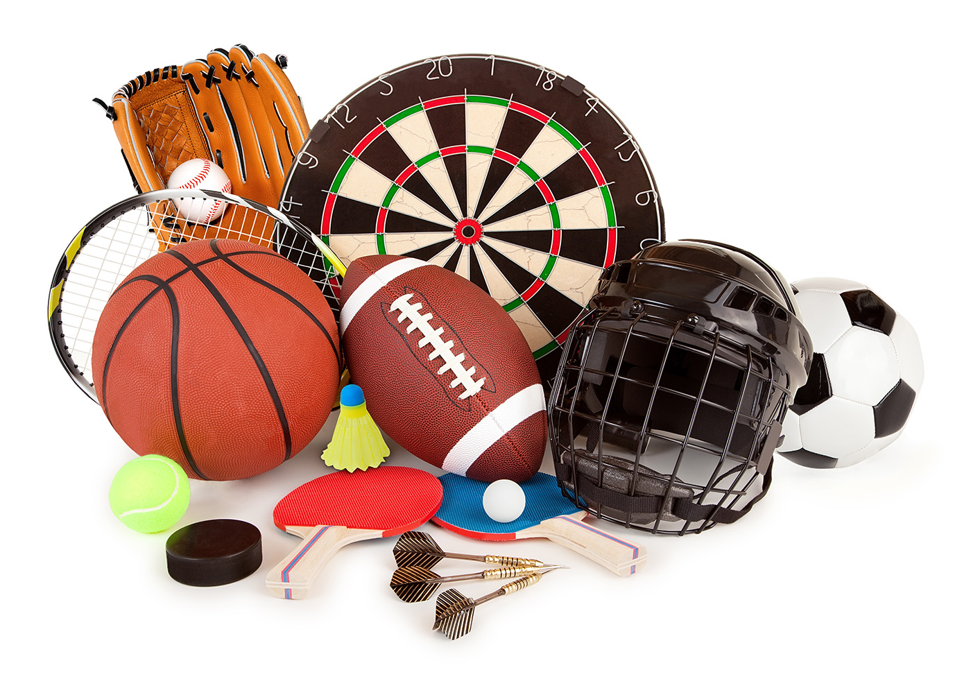
With over four million items from 15 of the largest sporting goods retailers, AmpleFind officially launches its one-stop sporting goods online shopping portal.
AmpleFind has announced the official launch of its sporting goods and clothing platform. The online store entices customers with an enormous collection of more than four million items from more than 15 leading retailers.
The market for sporting goods in the United States is enormous, and weighs in at $65 billion. Of this, $9.5 billion is raised from online sales, demonstrating AmpleFind’s potential growth as online shopping continues to grow and outstrip brick and mortar businesses.
The one-stop shop includes a curated list from retailers including REI, Zappos and DICK’S, among others, with a mission to create the best shopping experience on the planet.
“When we first established AmpleFind, it was to answer the problem caused by an overly complicated system for buying sports goods,” said co-Founder and CEO Nick Zamanov. “AmpleFind is fixing that problem. Users can now browse millions of items from a range of top retailers, without having to repeatedly login to different accounts for different stores.”
Users of the platform don’t have to signup with multiple accounts by adding their credit card information over and over again through various websites of the 15 leading retailers. AmpleFind’s shopping cart lets sporting goods lovers do all of their shopping from a single, solitary portal.
Payment information gets passed directly to the stores, meaning they do not process or store any customer payment details. It’s all done through the platform.
Zamanov started his first company after dropping out of college, and he spent 6 months homeless — living and working on his startup from his car.
With that kind of determination, the young entrepreneur has built a massive sporting goods platform that delivers most orders in two to three business days.
“We are targeting those people that want to get fit and active by providing them with a one-stop shop for all of the sports goods they could possibly need,” Nick continued. “Above all, we care about the quality of the products we are supplying and hope that we can encourage more and more people to take up a sport that they enjoy.”