

It’s amazing what can be done with raw data. YouTube user STLTransit has created over 40 visualisations of public transport activity across major cities and regions in Australia, Canada, the United Kingdom and the United States.
STLTransit uses General Transit Feed Specifications data published by various transit authorities when creating the visualisations. The General Transit Feed Specification (GTFS) defines a common format by which public transport schedules and other geographic information data can be communicated and used in an interoperable way.
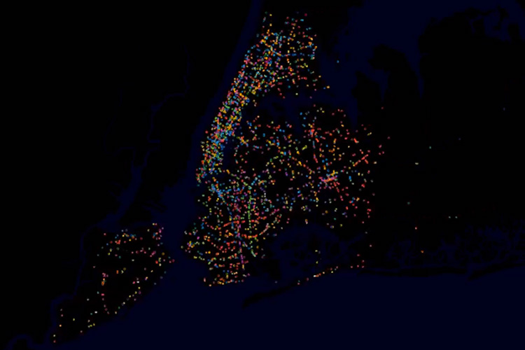
Each ‘dot’ denotes an instance of public transportation, with varying modes of travel, like bus, rail, or subway, differentiated by colour. In the example of New York City, each island is clearly visible, as is the city’s strict grid format.
Each video typically illustrates one weekday 24 hour period beginning at 4am.