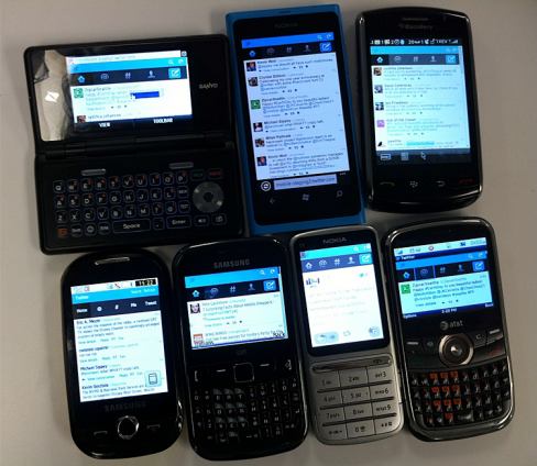
Twitter has released a major update to its mobile site, which now supports pre iPhone and Android browsers and devices, but why? We take a look.
Ask any web developer and they will probably tell you that browser support is a pain in the arse. Usually their ire is aimed (legitimately) at various editions of Internet Explorer. So, spare a thought for the developers at Twitter who announced today that they have completed their rollout of the optimized site to non-smartphones (feature phones).
In total the developers had to customize the site for more than 13 different browsers operating on thousands of mobile devices (the company says that have over 300 feature phones that they test on) in less than nine weeks. But here’s the real challenge: Twitter didn’t just have to make sure the site fitted on feature phones’ smaller screens but they had to develop the site to work with button interfaces and without many of the standard web languages in use today (JavaScript, CSS3, HTML5). This, the company says, presented a challenge for Twitter’s developers, who had to “relearn what was once comfortable and familiar.”
In those nine weeks Twitter took the mobile site and completely rebuilt it – this update isn’t just a lick of paint; the site now has a new back-end specifically optimized for mobile. The company says it also employed its vast collection of user data to understand how feature-phone users use the website. Twitter has a strong background in analytic-data informed development; speaking at the LeWeb conference in London last month Twitter’s Josh Elman described the staggering amount of data the company has access to and how it can employ this data to understand how users are (and in the future, will) interact with the site.
The first thing we did was look at and expand our collection of data. How often do people use the refresh control or load more Tweets? Where were the pain points with sign up or sign in? What Tweet actions did people engage with most? How often did people Tweet? We used data from all of these actions throughout the process to inform design and architectural decisions.
The company started off creating rough sketches of each of the actions a typical user completes – including signing up, tweeting, & DMing – and developed flows to allow them to complete these actions easier. Then the developers brought in Twitter’s latest features – the Discover and Connect sections – which older mobile users didn’t have full access to.
Look and feel
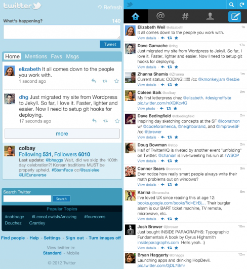
While also optimizing the site for older phones and restrictive tariffs that don’t support mobile browsing Twitter’s mobile redesign was also aimed at updating the interface to bring it in line with the desktop site. In many ways Twitter’s mobile site was a throwback to the original site design. Prior to the redevelopment, the site on older phones was still composed of the classic Twitter-blue and even the older Twitter logo (even though this went against Twitter’s own guidelines).
After all this, Twitter says that feature-phone users now have a better experience of the site. Pages are now 63% smaller, meaning users are downloading less but without any loss of functionality.
Keeping the tweets flowing
Developing for outdated browser and devices might seem like a waste of time but this release probably has more to do with Twitter’s ethos of accessibility than anything else. Helping users sign up and tweet from older cell phones is bound to be appealing to users in markets where the de facto smartphone standards, iOS and Android, are too expensive or don’t have significant market penetration.


