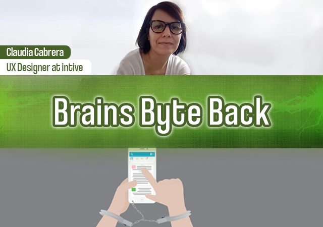
If you are unfamiliar with dark pattern design, then you might be thinking, as TechCrunch put it, “WTF is dark pattern design?” To put it simply, dark pattern design is when a user interface is carefully constructed to trick users into doing things they might not otherwise do.
And if you pay attention to the news, it will come as no surprise that tech products are ‘designed intentionally for mass deception.’
Today’s episode is the first installment in a two-part series that explores ethical user experience design — commonly known as UX design. In this interview, Brains Byte Back co-host Mags Tanev, is joined by Claudia Cabrera, a UX designer at global digital transformation company intive.
Listen to this podcast on Spotify, Anchor, Apple Podcasts, Breaker, Google Podcasts, Stitcher, Overcast, Listen Notes, PodBean, and Radio Public.
Cabrera strives to make better products through user-centered design and learning how these digital solutions create an impact in people’s lives.
In this episode, Tanev and Cabrera dive deep into dark pattern design techniques, what they are, how they’re used, what kind of impact they can have on us, and how UX relates to issues surrounding data privacy and the growing dominance of Big Tech companies in our lives. Hope you enjoy the show.
Furthermore, you will also learn why airline companies use timers when you are booking flights, how Facebook experiments on their users, and how eCommerce websites sneak extra purchases into your basket.
Disclosure: This episode includes a client of an Espacio portfolio company


