

Guest Author: Shashank Patel Associate Principal Information Designer, and Amritha Madam, Associate Lead Information Designer, at Gramener – A Straive Company
Data visualization, where raw data is visually represented, is so much more than creating charts and graphs. It’s about connecting the right dots to map out a clear, logical, and, most importantly, impactful story that a wide range of audiences can understand.
Moreover, poor data visualization poses a serious threat to organizations as it undermines effective decision-making processes and how these can propel strategic blueprints. Communicating the data is just as vital as collecting it in the first place.
A critical component of data visualization is information design, which incorporates storytelling and visualization to communicate complex data insights powerfully. Specifically, information design helps navigate and use digital products to improve efficiency and understanding for users while building relevant contexts and familiarity in their minds.
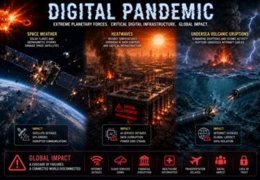
In the era of data visualization, during the COVID-19 pandemic, the world heavily relied on websites that integrated real-time data pertaining to rising COVID-19 cases and interactive experiences to inform people during lockdowns.
Information design has a valuable role in other areas beyond saving people’s lives. Let’s explore how Gramener-Straive recently collaborated with a cybersecurity organization to transform their platform with the power of effective data storytelling, as well as key learnings from this experience.
Designing for the world of cybersecurity – Case Study
The design team at Gramener-Straive collaborated with a client in the cybersecurity industry to create a tool for managing and addressing cybersecurity threats. The goal was to provide a solution that helps the client quickly identify high-priority threats and take swift action to resolve them.
The client’s existing digital product, used worldwide for enterprise security management, required deep insights into the competitive landscape. This was especially important as many tools were moving to web-based platforms, and customers were frustrated with the need for additional software installations.
The preliminary research involved analyzing competitors and identifying UX gaps in typical threat management platforms. Interviews, workshops, and exercises like card-sorting, helped uncover user needs and problem areas. This insight guided the designer in understanding the platform’s features and defining the best way to present the information.
As the design phase progressed, the focus shifted to addressing key project requirements and timelines. Throughout client engagements, design thinking was emphasized to identify customer pain points and improve service. Based on research and workshops, initial wireframing began, bringing the client’s vision to life.
Designing for simplicity – reimagining the representation of the MITRE ATT&CK framework
The pressing need was to visualize the MITRE ATT&CK framework, which involves several columns for categorizing threats, in a simple and engaging manner so that critical threats can be identified right away, with minimal interaction from the user.
Many users were already familiar with the framework, especially in areas like reconnaissance or defense evasion. So, instead of reinventing the wheel, the team built the design around what they knew best—the framework’s familiar table structure.
The real work came in the iterations. The research team explored different design themes, adding enhancements like color coding and visual indicators to highlight threat levels across columns. The key goal was to make it easy for users to quickly spot low, medium, and critical threats without diving deep into the data. At a glance, they should see the most pressing issues and take action.
The team stuck to a simple three-step process:
- Allow users to spot the total number of cases.
- Quickly identify the priority threats.
- Provide a clear summary at the top of the final visualization.
For example, if a user wanted to check on Defense Evasion, the dashboard would instantly show that there’s one critical threat needing urgent attention. This way, the visualization served its purpose without requiring users to spend unnecessary time hunting through layers of information.
Finalizing the experience – Information Design in action
This called for taking a real-life framework and converting it into a visually interactive solution that would be simple and useful for the end-users. The objective was clear: the team wanted the “wow” factor, but it had to come from the usability, not overwhelming visualizations.
Through multiple iterations, the design team managed to transform a complex framework into an intuitive and interactive visualization. It was a team effort in refining and testing the design, ensuring they maintained a balance between simplicity and insight. The final product offered users a seamless way to interact with their data—stripped of complexity but rich in actionable information.
The team implemented a streamlined, three-step process. The dashboard starts with a broader view of all active cases, which were approximately 40. From there, users could use filters to narrow it down based on severity, industry, or threat type.
With just one click, the list would shrink significantly, from 40 to around 13 cases. Another click could highlight which cases were unassigned or already addressed, further narrowing the focus. For example, by filtering for unassigned cases, the list could be reduced to a critical few—often as low as seven high-priority items.
At this point, users can easily assign cases to their teams and manage the workflow directly from the dashboard. The team also incorporated additional filters, allowing users to drill down even further by industry or technique.
However, the real success of this design lies in its ability to reduce the visible data to only what’s most critical, cutting through the noise so users can make decisions faster.
Key Learnings
The entire process underlined this vital point: Data visualization isn’t just about displaying more information, it’s about creating interactions that allow users to see less information at-once, focusing their attention where it matters most.
Effective research is indispensable for honing the best approach for tackling the data design challenges. By speaking with professionals from small to large teams and learning how they monitor systems 24/7, the research team was able to effectively gauge and understand users’ most prominent pain points.
Syncing design and development is another vital consideration. During the project, the team encountered a situation where a design approved by the client looked completely different post-development, leading to some frustration on both sides. The developers and designers worked together for a week to overcome this friction, ensuring everything matched, from colors to fonts, leading to smoother future processes. This reinforced the value of syncing design and development early and often for better results.
As information designers, we aim to blend creativity and analytical prowess to create visually engaging and interpretable masterpieces out of raw data. Information design is about extracting the core narratives data has to offer in order to captivate audiences.
We understand that data is more than just numbers: it’s a story waiting to be told. With every project we strive to make data not just accessible, but also actionable.
Disclosure: This article mentions a client of an Espacio portfolio company.