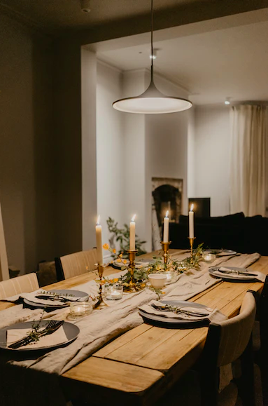
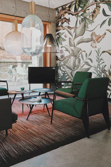
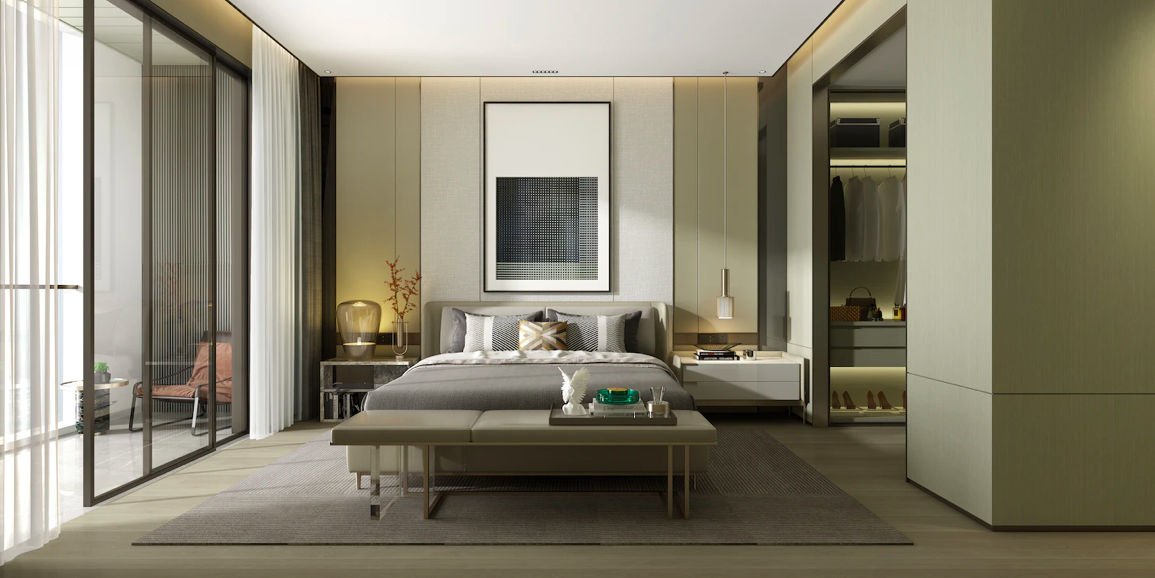
It’s time to accept that maximalism has taken over hotel design: Interiors are oozing with unconventional hotel lobbies and lavish bedrooms. And these extravagant decors have a bold term to go with them: Kitschy kaleidoscopic, a new way to furnish luxury interiors and scream personality. While kitschy describes deliberate excessive garnishings and poor taste ironically, the kaleidoscopic counterpart means the use of complex, multifaceted, and multicolored patterns.
Hotels often have massive budgets for design due to the many investors involved. But an unconventional design that grabs customers’ attention doesn’t need to be super expensive—‘weird and wonderful’ can be pretty simple. So, let’s dive into some specifics.
Table skirts for the win

Table skirts have always represented wealth and style—think Medieval banquets. But now the unexpected craze of tableware is starting to reshape our modern hotel decors.
The skirts give an instant playfulness to any room and can be adorned with glassware, wildflowers, a stack of books, or a lamp with matching fabric. Back in the day, hosts even used to match their table skirt fabric with napkins.
To revisit the historical past, the glorious bedrooms at the Four Seasons in Florence pair frescoed vaulted ceilings with natural light, chandeliers, and dark lilac table skirts. The mix just oozes decadence, and the opulent suites are a never-ending feast for the eyes.
Matching prints of every kind
The chinoiserie style came from ‘chinois’—the French for Chinese—and was inspired by art and design from China, Japan, and other Asian countries in the 18th century. It is warm, inviting, and cozy, and some luxurious boutique hotels across Paris are decking out whole rooms to fit the aesthetic.
Matching chinoiserie prints can be as simple as having a dresser, tray, and window all sharing a similar pattern. And Hôtel du Petit Moulin is the queen of this: They playfully match headboards with nostalgic wallpaper and luxurious linens. Other marvelous maximalist mixing includes pairing curtain designs with pillows or wallpaper with chairs.
Color blocking: Limited palette or electric block colors
Color blocking is a beautifully bold move. It can either mean having furniture, walls, windows, floors, and ceilings all the same color (known as palette limiting), or it can translate to using a range of different bright block colors instead of patterns.
When the whole backdrop is the same color, other essential objects like chairs or duvets can take a center role. It is oddly harmonious, despite being over the top and seemingly overwhelming.
For example, take the cerulean blue block color used at the Chase Club bar area at the Art Deco-themed Chase Park Plaza, St.Louis. It dates back to 1922, and the likes of Jimmy Carter and Frank Sinatra have stayed at the hotel. Its pillars, ceilings, and walls are all painted that dark, sultry blue, meaning that the black and white checkerboard floor and draped, golden chandeliers stand out.
Alternatively, another unconventional design is to opt for the electric palette as block colors. At the Shoreline Hotel Waikiki, Hawaii, the sharp yellow, deep pink, and bright neon blues are all “about paying homage to the bold bounty of our island home.”
Private or public, it doesn’t matter: Consistency is everything

I’ve noticed hotels are choosing to repeat the use of particular objects across public and private hotel areas.
An example is dotting the same pillows around the dining room and bedrooms. It’s a subtle way of showing consistency in design and adding a touch of homeyness to spaces that can seem a bit extravagant.
For example, take Mayfair’s Twenty Two Hotel: They follow this trend to perfection with a statement, blue velvet chair peppered throughout the lobby and private rooms.
The reason for this is obvious: The hotel designer, Natalia Miyar, previously worked with private clients and is now making her debut designing hotels. So, she’s borrowing some of those domestic details from residential living at its best to shared spaces.
The future of glass: Open-plan bathrooms
Remember those fascinating whirlpool bathtubs in hotel spaces and bedrooms from the 70s and 80s? In a sense, this is coming back. I don’t mean the actual whirlpools but that idea of dropping down the barriers and having bathrooms that aren’t exactly private.
Wall partitioning in guest rooms can diminish light and reduce space—but in the 2000s, slatted panel walls and drywall were seen as necessary for bathroom privacy. However, as the size of bedrooms in hotels continues getting smaller, transparent bathroom windows and smart glass—which change from clear to milky or opaque at the flick of a switch—are taking off.
If you go away to a hotel with your partner and are staying in a unique space, would you want partially see-through walls between the bedroom and bathroom? Well, the 200-room Equinox Hotel, located in the heart of the Hudson Yards development in New York City, is now complete with switchable smart glass in the bathrooms. Its philosophy is to use technology to help people recharge, connect, reawaken, and wind down.
The Click Clack chain in Colombia, designed by Plan: B Architects, is also notorious for using glass enclosures for bathrooms. In their Medellín-based hotel, the architect Laura Kate Correa designed separate glass containers for the toilet and shower, with the sink outside in the main room—it makes the rooms seem more spacious and bright.
While in Bogotá, the shower containers have black matt coverings with etched quotes like “curiosity is one of the most permanent and certain characteristics of vigorous intellect” along with cutout keyholes. All these features can make things a little more exciting with your partner.
Hotel design is constantly evolving with the times or returning to older trends, which may seem backward or unconventional—but for some reason, it just makes sense.
This article was guest authored by Devin Shaffer, Lead Interior Designer at Decorilla Online Interior Design.
Disclosure: This article mentions a client of an Espacio portfolio company.


