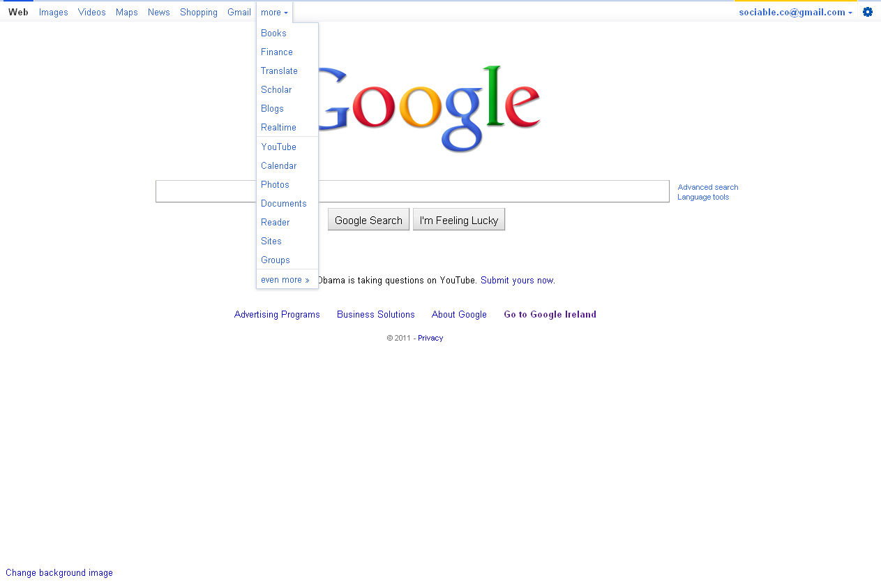
Google appears to be in the process of rolling out an improved search interface for US (.com) users. The new design features a larger search box as well as a gray navigation box at the top of the screen. While Google has had a top navigation for some time it has never been this prominent or stylised.
The “More” link now also contains more links to Google services
Users are also now given a new “Settings” link on the top right which gives access to search history and account settings


