Dropbox is an odd beast. It’s an application on which millions of people and companies depend, it’s been the subject of dozens of acquisition rumors (including from the likes of Apple), and it’s the leading cloud storage service (even beating competition from Google).
But the company’s branding and design is hardly what you would expect from one of the hottest tech companies in Silicon Valley. Stick-figure characters and stark white interfaces don’t suggest the power of the technology behind the service.
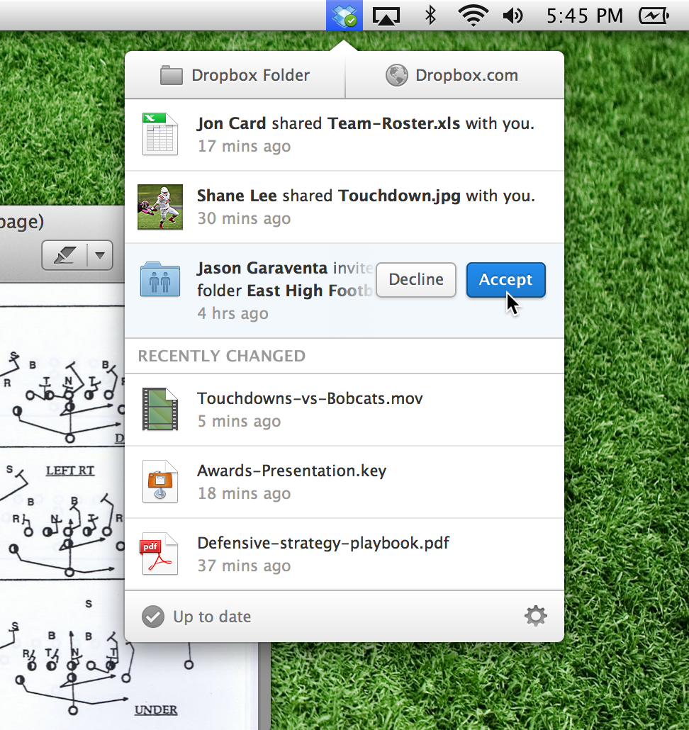
Today we got a hint that this might change, with the release of Dropbox 2.0 for desktop users. The new Dropbox application does the usual stuff, uploads and downloads your files automatically but, significantly, it also features a new interface.
Along with the new design and layout we also get new information flows, so more important information is visible straight after you click the icon.
“We’ve made it easier than ever to accept invitations to shared folders, see links or albums that people have shared with you, and keep tabs on what’s changed in your Dropbox.”
The outcome of the redesign is probably more visible for Mac than PC users but in both cases it’s an improvement on the previous release. It’s now easier to get to your Dropbox folders (online and off) and it’s easier to see which documents were changed most recently.
This Dropbox menu acts like Facebook’s notifications icon by showing you all changes that have been made to your personal and shared files. The application will also notify you of new shared content in real time. These live notifications are also shared across the company’s iOS and Android apps, which were both updated today as well.
But there are some limits with the app. On the Windows version we tested, sharing folders and files still requires browser access and can’t be done directly from the notifications bar (which is an irritation if, like me, you can never remember your password).
While the update to the desktop application is long needed, it still feels like there’s more the company could do to make the PC and Mac experience more engaging.
If you want to upgrade to Dropbox 2.0 you’ll need to download the application from the Dropbox website (there’s no auto update feature). iOS and Android users should see the new app available for download in their respective markets from today.


