This is a guest post from Cathrine Andersen, the co-founder of the multiple award winning start-up CanvasDropr. CanvasDropr’s browser-based web app help companies big and small (the big ones include the likes of Oracle, HP, Sony, and Cisco) to collaborate online via user-friendly rich media interface.
In this guest post Cathrine explains why CanvasDropr decided to drop its traditional user feedback button in order to provide a better customer service to its users.
Quality user feedback is essential for a company like CanvasDropr (Facebook | @canvasdropr). We were having some issues with retaining users and weren’t receiving enough feedback in order to know exactly what our users really wanted from the platform. One idea changed everything about that.
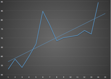
If you want to know how an idea by our CTO (and co-founder) Christian Rasmussen radically increased the amount of quality feedback from users and customers and thereby increased the overall user satisfaction from 55% to almost 90%, making CanvasDropr a profitable business in Beta – all in just 15 weeks – keep reading.
What we changed is all about how we collect feedback from users. We used to have a feedback button in the right hand side of the page for users to hopefully give us their thoughts about our product. A pretty standard approach to user feedback. We were working with initial customers and early users face-to-face, on Skype, etc. but with limited resources there was no way we were able to get all the quality feedback we needed to develop our product in the right direction, driven by users.
Our feedback button was hardly being used – it gave us virtually no quality feedback.
Then we did this one thing. One thing. And the amount of valuable user feedback increased from almost nothing to over 60% of new and old users giving us feedback that we could actually use to improve.
In a matter of weeks, actually only six weeks, our user satisfaction skyrocketed. Some 15 weeks into the experiment, we’re at almost 90% satisfaction.
So how did we achieve this? We developed a Binary system for User Experience, measuring the user’s previous behaviour and the context inside the platform and then prompting the user with a binary feedback decision. E.g. this one is prompted to new users after roughly 2 minutes using the canvas (it doesn’t pop up, it just appears in the top where it doesn’t disturb the user’s work).
This way, we pose people with binary decisions, not large input fields that makes the user feel they have to put a lot of effort into their feedback form. Almost every time a user clicks ‘needs work’, they type in the reason. This context-based feedback system is the single most important step that we have taken at CanvasDropr to make the user experience better.
In the market research business, it was found that consumers are increasingly saturated by market research and that this has lead to decreasing response rates and an increased danger of response bias. Market researchers have to solve these challanges and think of new, innovative ways of recruiting respondents, increasing response rates and reducing respondent fatigue by making survyes as short and ‘respondable’ as possible.
This is not only a challenge for companies conducting market research or surveys, this might also be happening in the software business. Users are signed up for more and more services online, they are faced with ‘feedback’ buttons and surveys in a lot of places and everything looks the same. First-movers and heavy users of our products are the ones that we need to get an opinion from to develop or product, to attract more users and to, ultimately, make more money. To get that valuable feedback, we’ve seen great results taking a more deepand strategic approach to user feedback as one of the most important aspects of our business.
We have definitely waved goodbye to our good old feedback button, probably the smartest move for our business so far.
We first posted about Binary Feedback in our company blog a little while back. The reaction to the post has been overwhelming; it went around the world and we have an inbox full of requests to make this into a more generic framework for easy implementation in other web apps. In a day where most startups are “lean” and talk about shortening feedback loops, the idea about binary user feedback seems to catch on well and can hopefully more companies consider changing the way they collect feedback from their users.
This article has been reproduced, with some alterations, from Cathrine’s original post on the CanvasDropr blog. You can learn more about CanvasDropr on their site and social media profiles (Facebook | @canvasdropr).


