

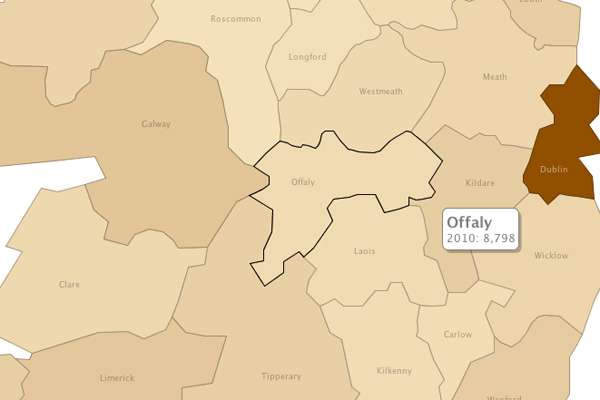
The data collected and shared by the Central Statistics Office Ireland (CSO) is both expansive and extremely important, but not very interesting as it is currently presented. We’ve taken the average yearly live register figures for each county and attempted to transform this raw data into something much more useful and appealing.

We used an IBM Research experiment known as Many Eyes to create this visual illustrating the spread of unemployment in Ireland over the last eight years. The darker regions denote higher levels of unemployment, whereas light regions convey low levels of unemployment.
Click the visualisation below for a closer look, or hover over individual counties to reveal figures.
Alternatively here’s a still image of the same visualisation:
The spread of Irish unemployment by county from 2003 to 2010