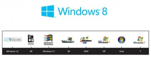
Microsoft has unveiled the new Windows 8 logo. It moves aways from the accustomed four-colour flag to a cleaner, more window-like logo – which happens to look a lot like a Nordic Cross flag!
According to Microsoft, the new Windows 8 logo will help better reflect their Metro-style design principals, while reconnecting with “some of the powerful characteristics of previous incarnations”.
The original Windows 1.0 logo did resemble that of an actual window but evolved into a more flag-like symbol from Windows 3.1 onwards. Now, Microsoft want to “return it to its original meaning” and bring Windows “back to its roots”.
The new logo carries Microsoft’s Metro principals, a typography-based design language influenced heavily by Swiss graphic design, and is described as “authentically digital”. It has perspective that adds a slight sense of motion, which apparently aligns it with the “fast and fluid style you’ll find throughout Windows 8”.
The single Windows 8 logo that has been released is blue in colour, but this is variable and will change in hue to reflect personal user theme settings. Microsoft Windows 8 is expected to be released before the end of the year, possibly in October.


