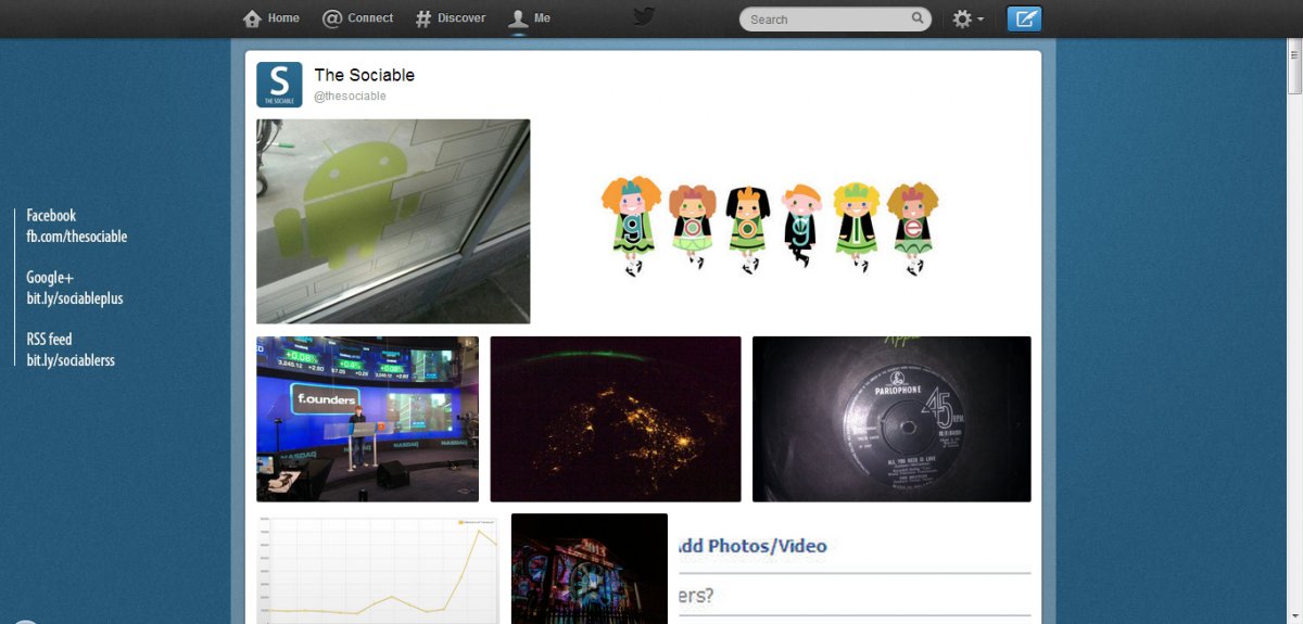
In the past few days Twitter has quietly rolled out a small update to how it manages users’ images. But this small update could make a big difference to how we view Twitter as a media destination.
With the new update users are able to see their images and videos on a single page in a grid format. And while this might sound insignificant, it’s an important change for Twitter, as the company moves to position itself as more of a media company than a social network.
You can view a user’s images in this format by clicking on any of their images and selecting the grid icon to the top left. You can also go directly to the grid page by using this url (just change thesociable to the user’s Twitter handle) https://twitter.com/thesociable/media/grid
If you look at the latest updates released by each of the three major social networks in the past year, the majority of these have focused on images. Twitter, Facebook, and Google+ have been spending a significant amount of time making it easier for us to upload images, edit images, and share images.
This week, Google+ released a feature that lets users set animated gifs as their profile photos, while in the past year it has released photo sphere and now shows higher quality versions of users’ images.
Facebook implemented drag-and-drop image uploading in December and earlier in 2012 it redeveloped its image gallery to show larger images to users. It also spent over $1 billion on Instagram.
But it’s Twitter that’s come the furthest. In 2011 it launched its own image handling service, pic.twitter.com, and in September 2012 it removed all third party image uploading sites from its app. Then in December Twitter, responding to Facebook’s purchase of Instagram, launched its own image filtering service. Twitter kicked off 2013 with the purchase of Vine, an animated image/video app that has yet to go mainstream.
They’re doing this because they know we like images. They know that users are more likely to comment, share, and like others’ images and videos than they are to engage with their plain text status updates.
Interestingly, this is actually something of a return to form for the site. When Twitter first launched its image handling services it came with a grid view but this was then removed – much to the displeasure of avid Twitter users.


